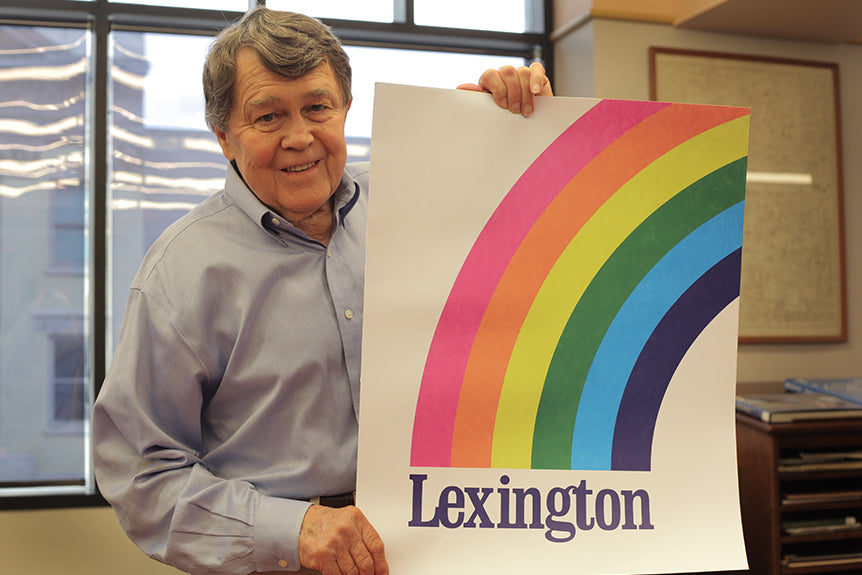
This week, we launch the 'Lexington Rainbow Print,' an emblematic and classic design with a rich history spanning back nearly 40 years. As we celebrate all things America we're also celebrating all things Lexington – a tip-of-the-hat to the town Kentucky for Kentucky calls home. This is no ordinary rainbow, but one with a long and virtuous story laden with love, destruction, and rediscovery. So gather round, friends, because we've got a tale to tell about a time of yore, the time of the first Lexington Rainbow.

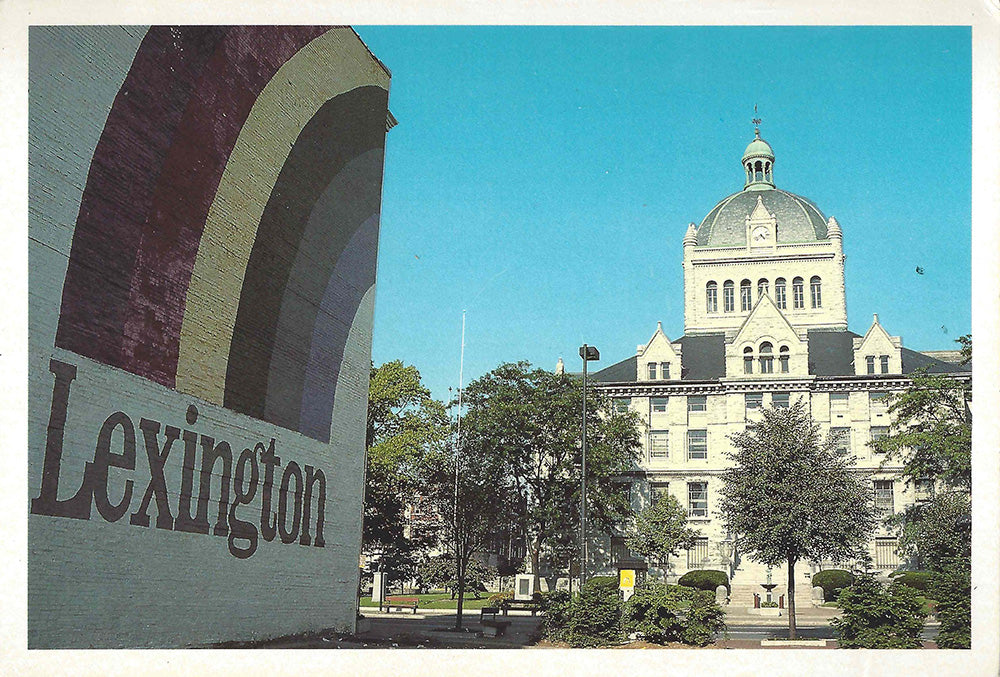
In 1975, Lexington prepared to celebrate the city's bicentennial, encouraging artists to submit their vision for a mural commemorating the anniversary. The winning design would be painted on the side of the Phillip Gall building, which once stood in the center of downtown facing the old courthouse. Ellsworth "Skip" Taylor, the art director of KET at the time, turned in a hand-drawn design that captured his feeling about the town he'd adopted as his own. Skip knew that Lexington was the real pot of gold at the end of the rainbow, and so he penned a simple sentiment to reflect this vision. He won the Lexington Art League contest and a sign-painter re-created the Rainbow in the middle of downtown.


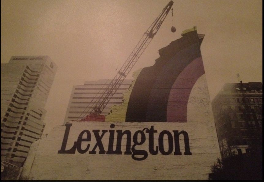
Though a handful of silkscreen prints with the same design were produced, the mural itself was lost when the building was demolished in the mid-1980s to make way for the 5th/3rd financial center. The prints were so rare that the artist himself no longer had a copy, and he simply assumed that the time of the Rainbow had passed. As he explained, "the biggest thing was that when they tore it down, that was it." We discovered the print when we were lucky enough to come across one of the original silkscreens at Vintage on Lime, a shop located right next door to the Kentucky for Kentucky offices. We've now resurrected the print – and we're ready to spread the Lexington love far and wide.


Regarding his own journey to Lexington, Skip told us, "What inspired it [the Lexington Rainbow] was my background. I was born in New Jersey and had spent my life there before going to college." Skip wanted to go to medical school, which was not an option in New Jersey, and so he began to consider other options: "A friend of mine was all set to go to Kentucky, his people were from there, and I thought, why don't I go there?" Skip and his friend headed South in style, "The two of us came down here in a topless convertible model A Ford and made it without any kind of happenstance or problems and made it into the dorms at UK. That was my first experience with the environment and certainly the people, something other than what I was brought up in in New Jersey where people were always too busy to stop and talk and be friendly."

For Skip, Lexington was completely different experience from his childhood in New Jersey, where the fast pace of life had never really fit with his personality. He felt at home in Kentucky, a place where, as he said, people stop and let you pull into traffic and idle their cars in the middle of the road to talk to friends. He celebrates many of the same elements of the Commonwealth that we here at Kentucky for Kentucky love, "Of course there were the horse farms and the history and a different way of life, and it just stuck with me as a wonderful experience." Skip grew attached to his adopted home, but in the middle of his college experience, was called away to serve in the Navy, during which time he travelled all over the world: France, Italy, the North Atlantic, Africa, and Turkey. Near the end of his enlistment, he knew that Lexington was the one place where he wanted to be. He told us, "I wanted to go back to UK…I mainly wanted to go because it was a nice place, and I had all these experiences to compare it to, and it was still, as far as I was concerned, the best place for me."
Being away had solidified his love for Lexington and provided the inspiration for the print we're bringing to you today. Skip puts it perfectly: "When it came time for this poster contest I once again was able to recall all these other experiences and Lexington, to me, was as the saying goes, the end of the rainbow. It was almost like a magical place to me because it was just so easy and nice." Not surprisingly, Lexington is his favorite part of Kentucky, in part because of the resource the University provides, with the print shop in the King Library, the music, and the performing arts in general. Skip elaborated, "as much as I love mountains and horse farms, this particular sense, hearing and ballet, is available here and you don't find it very often."
When asked about his aesthetic, Skip explained that, through the course of his career as a designer and art director, he had been asked to think about typography as an essential element of human communication – "It's one of the great inventions of the human race: words, letters" – and therefore knew that the font he chose for the Rainbow needed to be classic and emblematic. In the 1950s, he worked in the basement of the journalism building, compiling posters, hand-lettering, designing University publications, and setting type. Eventually obtaining his MFA with a focus in painting, Skip has consistently integrated writing as an essential component of his work. The concrete poetry movement, wherein the typography and arrangement of words is a key component of the message, also inspired him artistically. As he told us, "type is, in my life, one of the most important things I've had to deal with as a professional…and so therefore I try to incorporate that because it's part of the American experience."
The Lexington Rainbow uses line, color, and type in a simple fashion that hearkens back to the aesthetic of the 1970s but remains beautiful and resonant today. Like Ellsworth, we believe that Lexington, as a beautiful part of this fine Commonwealth, could truly fall at the end of the rainbow. So now that you've heard the tale, get them while they're hot like the bright summer sun after a mid-afternoon rainstorm, friends. God Bless America. God Bless Kentucky. God Bless the Lexington Rainbow.
For sale Wednesday, July 2nd at 10am – $25 per print. 250 prints. Printed on French Paper Company Paper by Thoroughbred Printing here in Technicolor Lexington, Kentucky.
Words by Hannah Legris and photos by Stanley Sievers.


