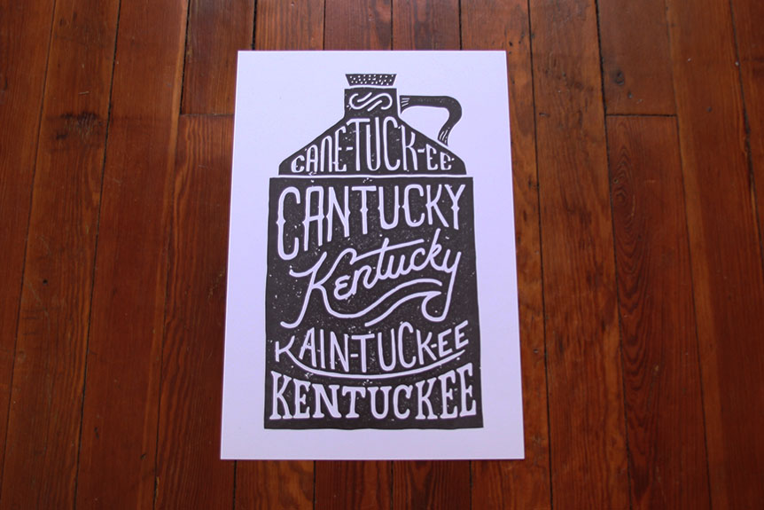
We delved deep into the historical vaults to dish up a little Kentucky history for y'all. This week, we're bringing you a poster and a shirt that celebrate the etymological roots of our kick-ass Commonwealth. The spelling of our state has changed significantly over time, and the primary origins are likely of Iroquois or Shawnee language meaning "meadow" or "prairie." Various other spellings have been pinpointed, and they are primarily of Native American origins. From Wyandot the term signifies "the land of tomorrow." Alternatively, Shawnee linguistic origins parallel the word for a river's head; in Algonquian it may mean "river bottom." According to the Kentucky Tourism Center, there are many possibilities for the original choices for the state name, including the theory that early Kentucky pioneer George Rogers Clark once darkly suggested – that the word means "the river of blood."

For this new round of posters and shirts, we enlisted Jeremy Booth to design our strange and historic spellings of 'Kentucky' into something even more special – in the classic container of a moonshine jug, of course. Booth – of 'Happy Chandler' fame – is a young designer and typographer based out of Louisville. After becoming inspired by the work of Original Makers Club designer Jon Contino, he began exploring hand-lettering and typography, and was encouraged by Over app creator, Aaron Marshall; eventually, Booth created the hand-lettered typeface Goon, which became popular on the app. That's when we discovered Jeremy and he got to work designing typography-oriented prints and t-shirts for us. The enthusiasm of our Kentucky for Kentucky following has given him a huge amount of exposure, pushing his career forward. As Booth enthusiastically informed us, "The success from that collaboration has landed me my first exhibit this year."

Though Jeremy spent a few years in LA, he came back to Kentucky to feel more artistically engaged and inspired. As Jeremy explains, "The mix between the city and outdoors is what really inspires me here. I can spend time downtown or go hiking at Bernheim Forrest. The city is filled with architecture, signs, and great food; all inspire me. I also enjoy the more natural approach, hiking, camping, and fresh air. Having both worlds here influences the aesthetic of my work." Beyond the natural and architectural world of the city, Jeremy has found a design community that has mentored, inspired, and engaged him as he grows into his position as an artist. Booth finds points of visual engagement all around him, but he's also part of a strong design community that hosts events to get a range of creative people together in one room. For example, "Louisville Designer Brews is a once a month meetup of designers and creatives created by local designer Chris Davis. We meet a pub the first Monday of the month, drink beer, and chat about design." Now that's the kind of gathering we can get behind.
This week, we have an epic "Cane-tuck-ee, Cantucky, Kain-tuck-ee, Kentuckee, Kentucky" print, designed by Jeremy Booth and printed on French Paper Company Paper in Lexington, Kentucky at Thoroughbred Printing. We only have a limited number of these available, so get them while they're hot off the presses. A limited number of both prints and t-shirts will be available on Friday March 7th at 10:00am on our website.


Product photos by Stanley Sievers, Jeremy Booth's portrait by Billy Grubbs, text by Hannah LeGris.


